· Quant · Articles · 8 min read
Focusing on accessibility and SEO with Google Lighthouse
In this post, we’ll take a look at some recent work we did focused on improving accessibility and search engine optimization (SEO) for the quantcdn.io website. This is a common activity for any website and needs to be regularly monitored and updated. There are many reports and tools you can use to improve your accessibility and SEO such as Semrush and many alternatives. One lightweight useful tool is Google Lighthouse.
In this post, we’ll take a look at some recent work we did focused on improving accessibility and search engine optimization (SEO) for the quantcdn.io website. This is a common activity for any website and needs to be regularly monitored and updated. There are many reports and tools you can use to improve your accessibility and SEO such as Semrush and many alternatives. One lightweight useful tool is Google Lighthouse.
In this post, we’ll take a look at some recent work we did focused on improving accessibility and search engine optimization (SEO) for the quantcdn.io website. This is a common activity for any website and needs to be regularly monitored and updated. There are many reports and tools you can use to improve your accessibility and SEO such as Semrush and many alternatives. One lightweight useful tool is Google Lighthouse.
What is Google Lighthouse?
Google Lighthouse, usually just called Lighthouse, is free software to help assess the quality of your web pages. You can use Lighthouse via Chrome DevTools, Chrome extension, Firefox add-on, WebPageTest, and PageSpeed Insights, as well as many SEO tools with more extensive reporting capabilities.
Just like with any other assessment tool, you should take the numbers with a grain of salt, but they are often a good indicator if things are particularly broken and need some love. You will sometimes get varying results from person to person and browser to browser and location to location and day to day, particularly for performance numbers, so keep this in mind when analyzing your web pages.
Why should we care about Lighthouse scores?
Google, for better or worse, is the ruler of search. You need to keep Google happy if you want a chance of ranking well in Google search results. Of course, there are alternatives to Google, but Google currently has 91.88% of the search engine market share with Bing coming in 2nd with a measly 3.19%. Ignore Google and you just can’t compete online.
The Lighthouse scores are broken up into five categories: Performance, Accessibility, Best Practices, SEO, and Progress Web Application (PWA) if you are creating web apps. Most people focus on the first four. You can also test desktop vs mobile where mobile takes into account the site’s mobile styles and typical speed limitations associated with mobile devices. Getting decent scores across these areas will be beneficial both for your site visitors and your SEO.
What are good Lighthouse scores?
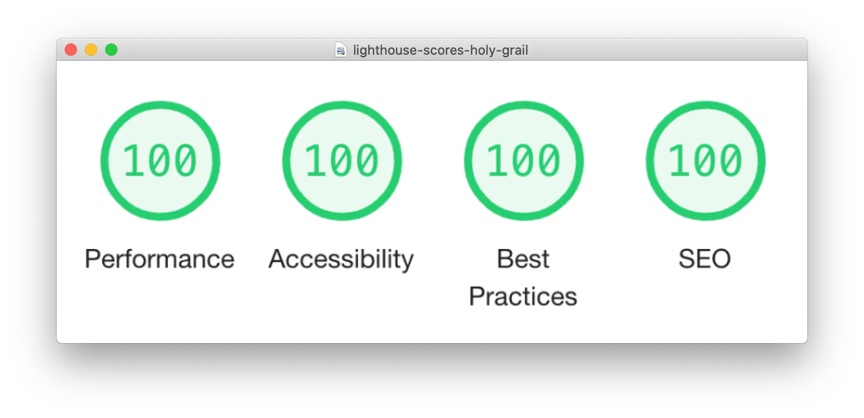
The Lighthouse scale is from 0 to 100, with 100 being the highest. The holy grail of 100/100/100/100 is actually possible (I’ve seen it) but not very realistic for sites of any size or complexity. Instead, it’s good to try to get more than 90 for performance and close to 100 for the other scores.
Though it’s typical that mobile performance scores will lower. A mobile score of 80 or higher is a sensible target. If a majority of your traffic is mobile, then you should shoot for at least 90 for your mobile performance score.
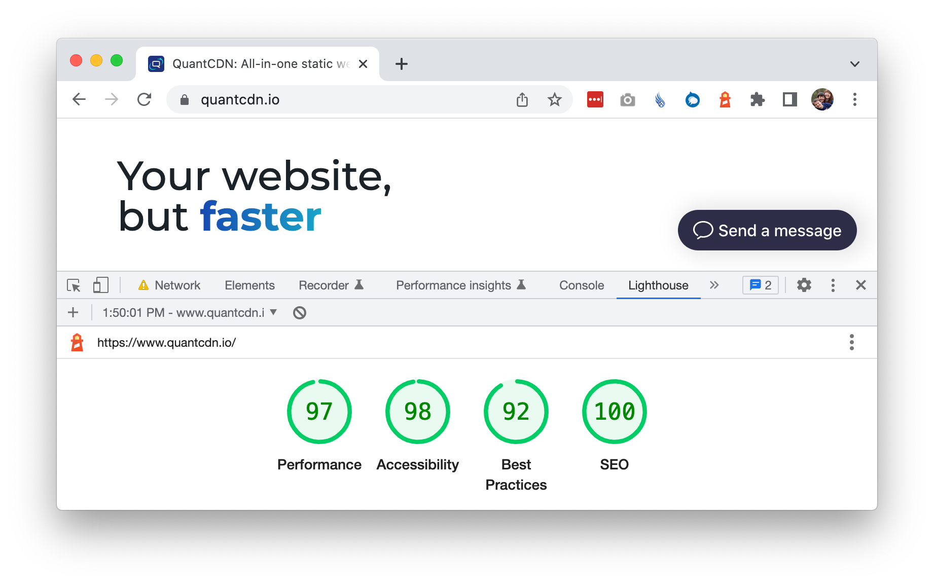
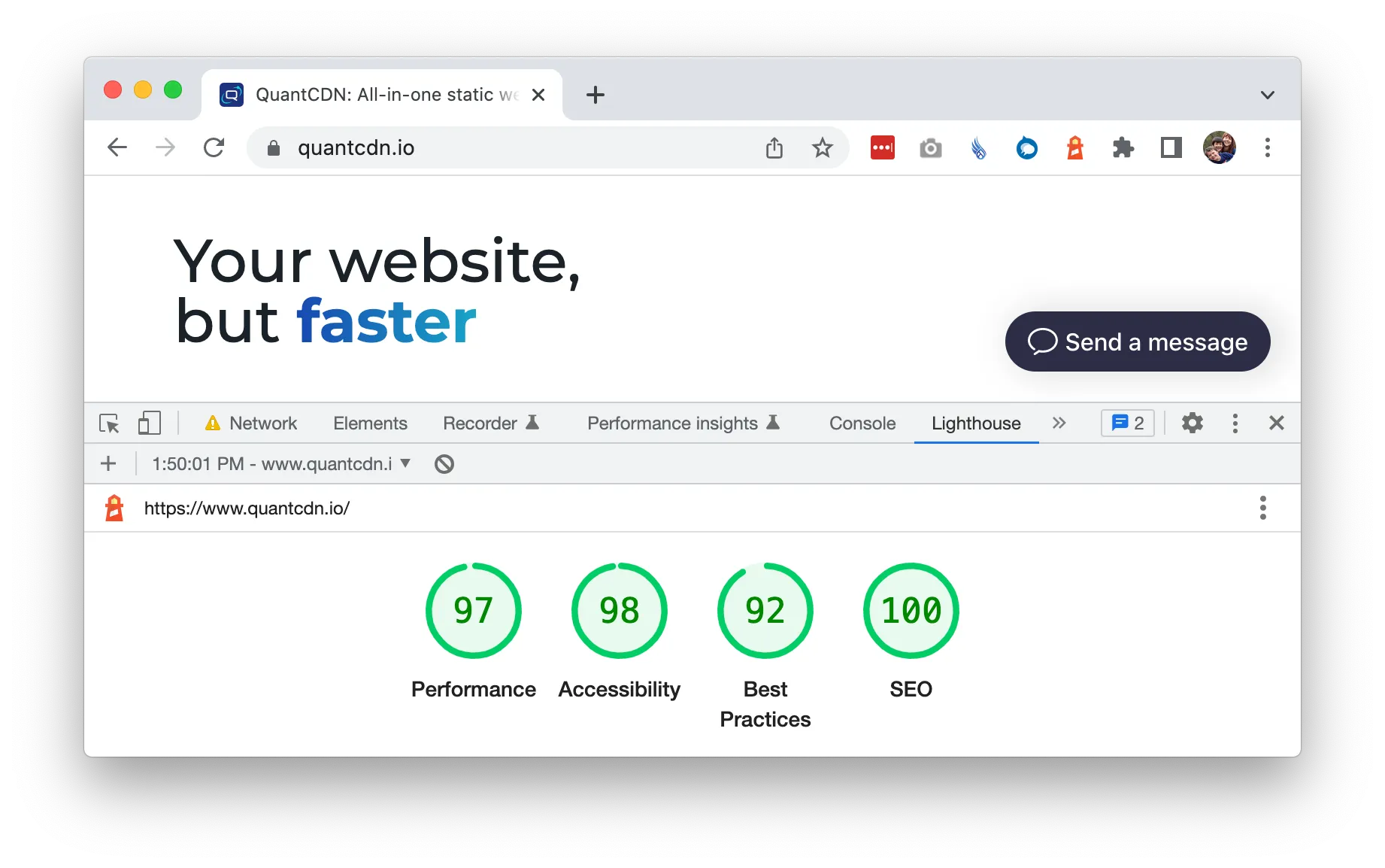
As mentioned above, the performance numbers are often the most volatile of the four. Note also that you will probably get different Lighthouse results depending on the method you are using. For example, when using Chrome DevTools, our home page scores were 97/98/92/100, while the Chrome extension gave us 99/98/100/100. This variation was pretty consistent with repeated runs with the most notable variation in the Best Practices score. The <100 Best Practices score with Chrome DevTools was always due to the 3rd party smallchat integration we are using. When in doubt, try more than one approach.
Our quantcdn.io Lighthouse focus
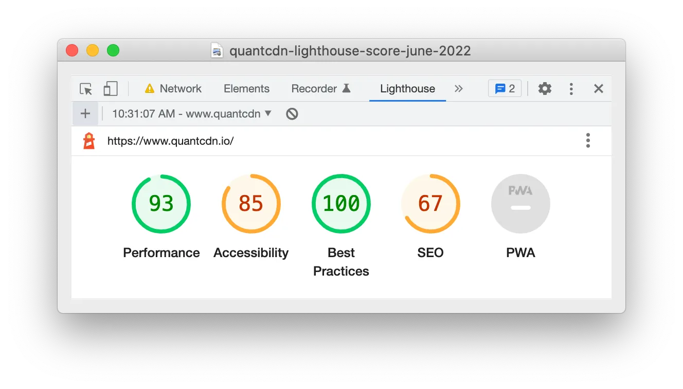
Since our Performance and Best Practices numbers were already decent on the site, but Accessibility and SEO needed some love, we focused on the latter. Our scores in June 2022 using Chrome DevTools were 93/85/100/67 (during one test) and we didn’t capture scores using other methods. The SEO score was particularly sad, but we hadn’t spent any time on these in the past, so it was not surprising.
Types of accessibility issues
We started first looking at accessibility issues and fortunately these were mostly pretty straightforward. They fell into the following categories: missing alt text, vague link text, improper use of headings, and contrast issues.
Missing alt text
Having missing image alt text is pretty common and easy to fix. This was just a content editing exercise. Fortunately we don’t have a ton of web pages, so we went through everything that had missing alt text and fixed them. This useful Harvard article talks about writing good alt text.
Vague link text
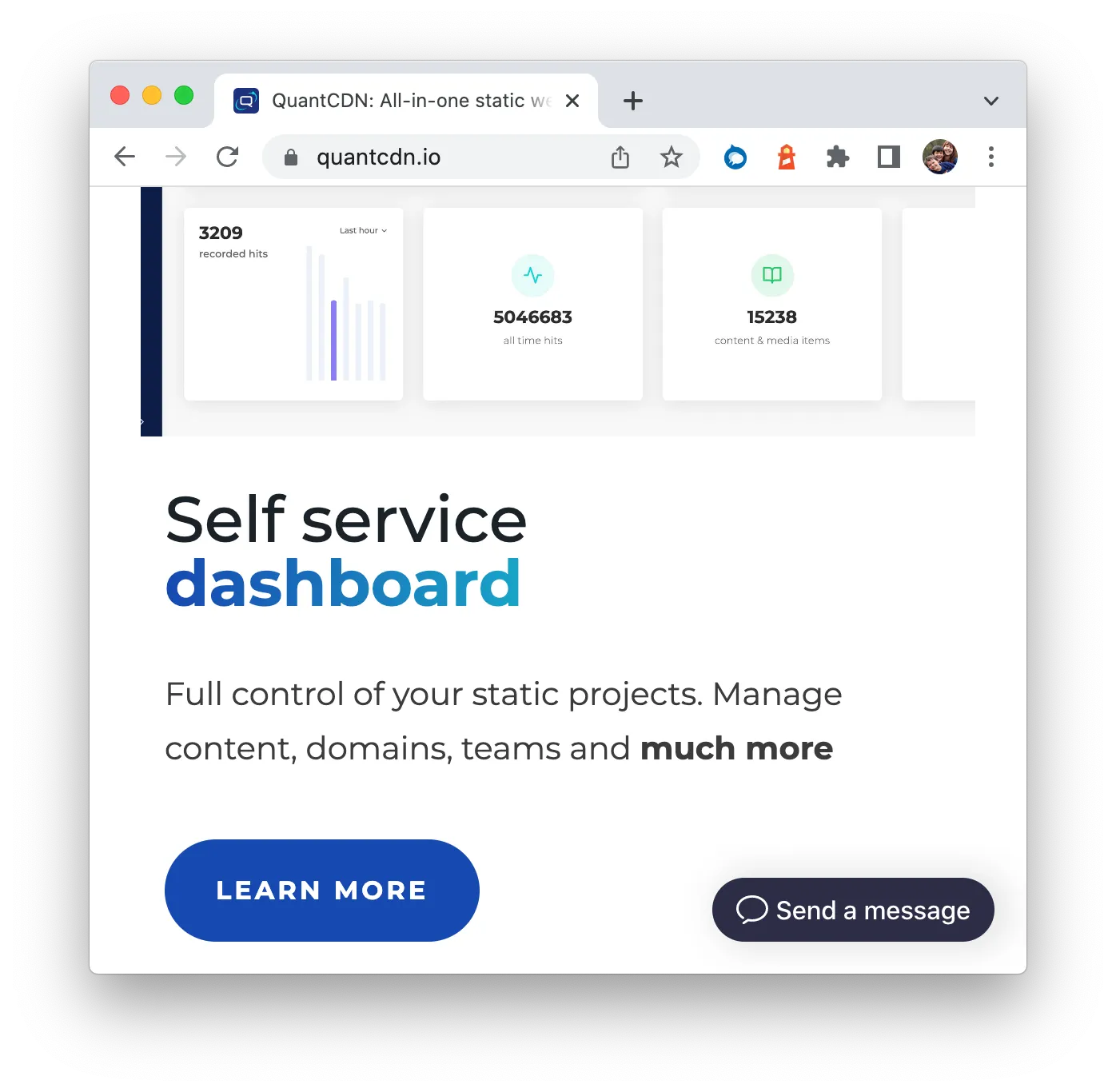
Generic link text like “click here” and “learn more” is frowned upon because it can be hard to understand the context of the link. It’s always better to add some specific words in the text if possible though this is a very very common issue. This usually is easy to fix for paragraphs of text but not as easy for buttons since we want them to “look prettier” and be shorter and more clickable. An example of a change we did was changing from “Learn more” to “See features”. While not hugely descriptive, it was an improvement. This Search Engine Journal article discusses alternatives to using “click here” type link text.
Improper use of headings
This problem was due to having content where headings skipped between levels. For example, we had an h2 and then jumped to an h4 rather than an h3. These were a little trickier to fix only because we wanted the styling to match what we had. This is actually a very common issue. Editors will choose a heading based on style rather than it being semantically correct and reflecting the structure. In order to preserve the previous styling, we added classes to the headings, so that they looked the same as before. This WCAG page has an example of heading usage.
Contrast issues
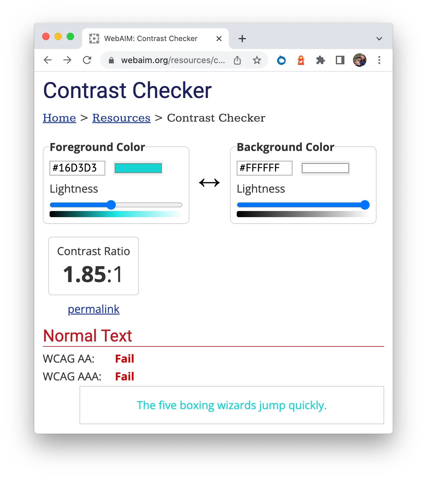
We had different contrast issues throughout the site for text on white background and for text on color backgrounds and for buttons. We have not fixed all of these yet as we are going through a redesign process at the moment but we did fix most of them. This required picking new colors that had better contrast. One useful tool for picking new colors is the WebAIM Contrast Checker though there are many options for accessibility tools. For example, Deque has a Color Palette Contrast Checker.
Our improved Lighthouse scores and next steps
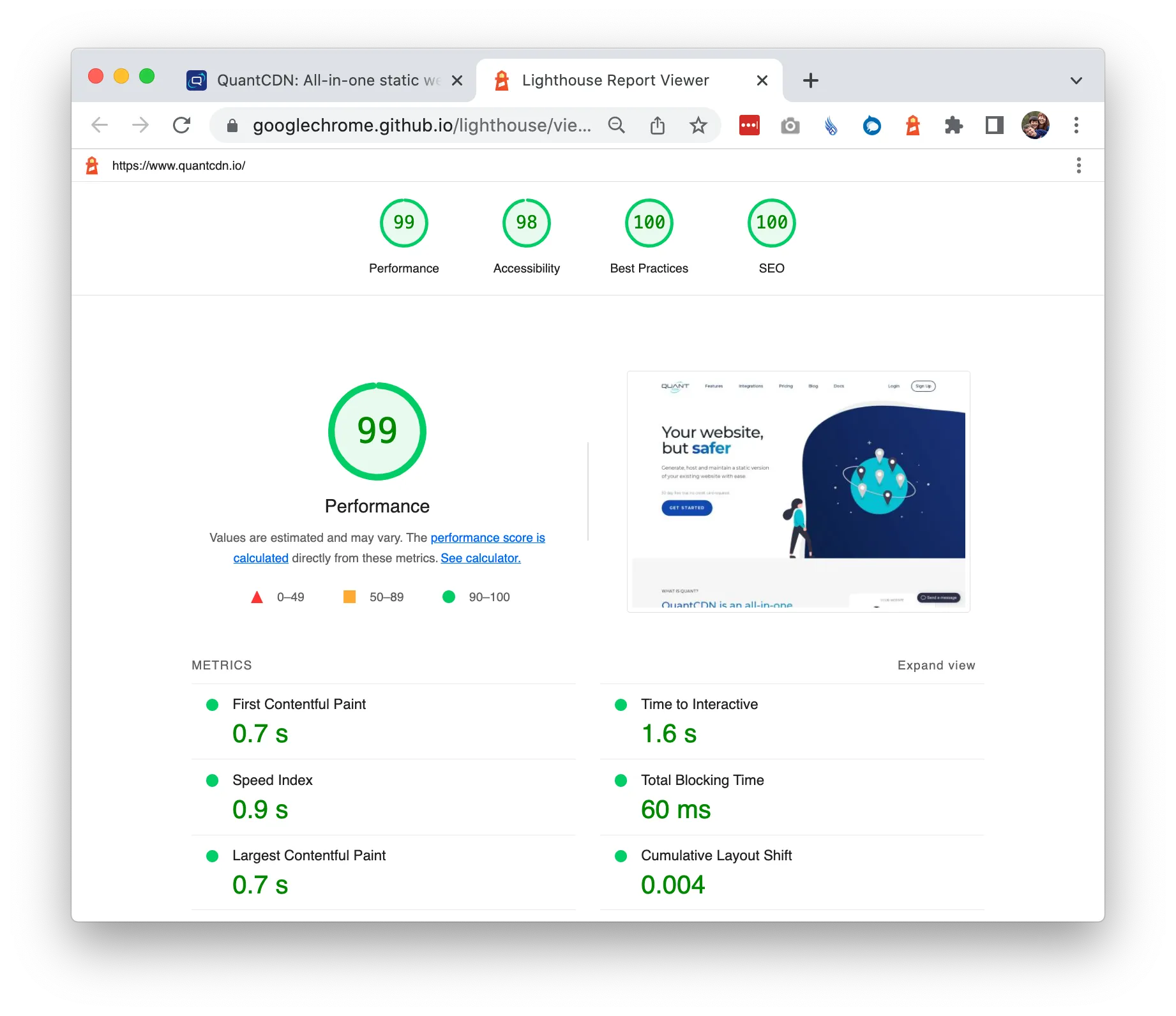
After a couple days of cleanup, we were able to get green desktop scores across the site with many of the pages closing in on the holy grail of 100/100/100/100… especially if you use the Chrome Extension! ;)
While this is just the first step in improving our website, it was an important one. We are in the business of hosting static websites and want ours to be a shining example.
More accessibility improvements
We use Drupal 9 for the backend of our website so we installed the Drupal Editoria11y Accessibility Checker module. This will help reduce some of the common simple accessibility issues going forward. Beyond that, the next round of accessibility improvements will use common accessibility tools for better assessment though there is no tool that will catch all or even most accessibility issues. It’s always best to involve real users with assistive devices when implementing accessibility improvements. Once we do our best using software tools, we aim to do user testing.
More SEO improvements
For SEO, we will continue using Semrush and Google Analytics though, after basic SEO hygiene, the most important thing is just providing useful information to your users. Content is still king. We will be adding more useful content on our site around Content Delivery Networks (CDNs), static hosting, Jamstack, static site generators, and CMSes, in particular, Drupal and WordPress.
Resources
Hope you learned something in our journey to improve the quantcdn.io website Lighthouse scores. Here’s a recap of some resources you might find useful.
- Lighthouse Tools: Google Lighthouse, Chrome DevTools, Chrome extension, Firefox add-on, WebPageTest, PageSpeed Insights
- Lighthouse Scores: Performance, Accessibility, Best Practices, SEO, Progress Web Application
- Other Analysis Tools: Semrush, Semrush alternatives, Google alternatives, Google Analytics, WebAIM Contrast Checker, Color Palette Contrast Checker, other accessibility tools, Drupal Editoria11y Accessibility Checker module
- Articles: writing good alt text, alternatives to using “click here” type link text, example of heading usage, involve real users with assistive devices
So meta…
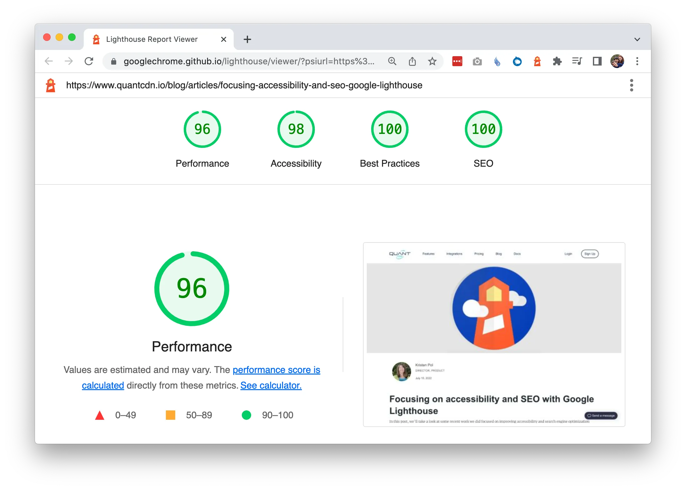
As a final check, I ran this blog post through Lighthouse (Chrome extension) and was able to get all green scores (96/98/100/100) after adding width/height to each image. Very meta! :) There are a lot more images on this page compared to other pages so I assume that had an impact. For improving this page, I scanned the Lighthouse report to see what items could be addressed easily and the image sizes were an easy win. Often much of the advice in the reports is simple to address.
